As a healthcare innovator, I’ve created a proprietary software infrastructure that transforms mental health care delivery. This innovative tech streamlines in-network care and empowers clinicians to provide personalized patient-centered care.
My role
Hired and managed a product design team of 4
Developed and maintained a design language for a new patient management tool
User research, prototyping, UI design
Developed and maintained a design language for a new patient management tool
User research, prototyping, UI design
Results
Our patient care platform achieved remarkable growth, surpassing its initial year-end projections, ultimately driving a successful Series A funding round.
This impressive performance also led to strategic partnerships with prominent healthcare companies, solidifying our position in the industry and paving the way for further growth.
This impressive performance also led to strategic partnerships with prominent healthcare companies, solidifying our position in the industry and paving the way for further growth.
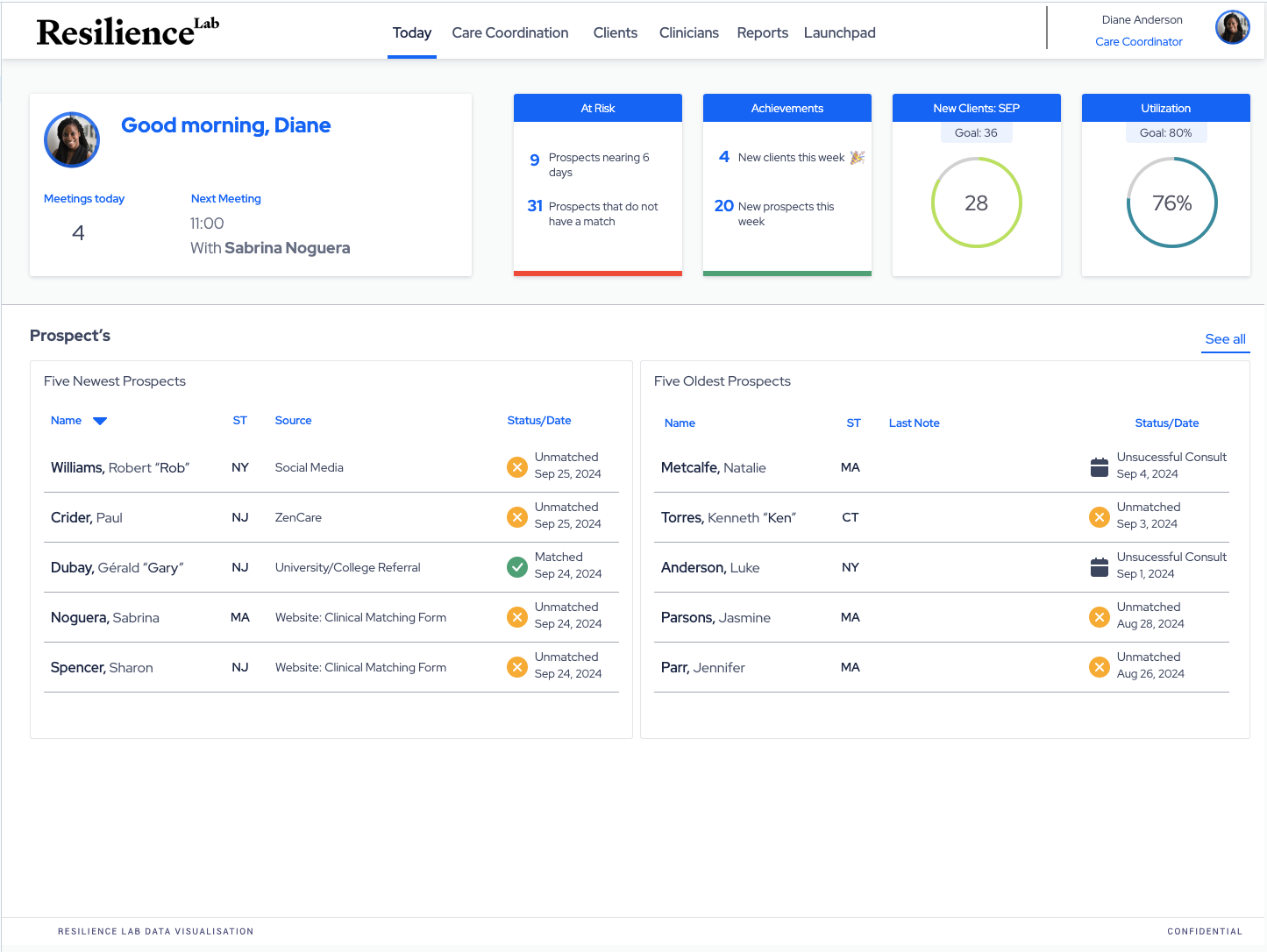
Resilience Labs began as an internal project, developed from scratch with makeshift software that eventually became a standalone product. We set out to create a more seamless experience for finding and booking therapy sessions in busy cities like Boston or New York, where access to mental health services can be limited.
To ensure our solution met the needs of both therapists and patients, we applied Human-Centered Design (HCD) principles and service design approaches throughout the development process. We conducted extensive research, gathering insights from users through surveys, interviews, and observational studies, revealing the pain points and challenges faced by individuals seeking mental health support
To ensure our solution met the needs of both therapists and patients, we applied Human-Centered Design (HCD) principles and service design approaches throughout the development process. We conducted extensive research, gathering insights from users through surveys, interviews, and observational studies, revealing the pain points and challenges faced by individuals seeking mental health support
With a deep understanding of our users’ experiences, we began designing prototypes that prioritized their needs. We conducted usability testing with real users, gathering feedback on each iteration to refine our design. This cyclical process allowed us to validate our approach at every turn, ensuring that our solution would be both user-friendly and effective in addressing the mental health needs of urban populations.
By applying HCD principles and service design approaches, we were able to create a platform that not only improved the booking experience but also helped increase access to mental health services in urban areas. Today, Resilience Labs is proud to be a trusted partner in the pursuit of better mental health outcomes for individuals everywhere, committed to empowering those seeking support with innovative solutions that prioritize their needs and experiences.
By applying HCD principles and service design approaches, we were able to create a platform that not only improved the booking experience but also helped increase access to mental health services in urban areas. Today, Resilience Labs is proud to be a trusted partner in the pursuit of better mental health outcomes for individuals everywhere, committed to empowering those seeking support with innovative solutions that prioritize their needs and experiences.
We battled to gather sufficient information to facilitate effective matches between therapists and clients, balancing the need for data with client comfort levels and expectations.
During the COVID-19 pandemic, we recognized the urgent need for mental health services to transition online, as in-person sessions became increasingly difficult or impossible. The crisis created an unprecedented surge in demand for telemedicine services, and we knew that every minute counted. We designed our platform with two primary use-cases in mind: therapists seeking clients who match their specialties and client needs, and clients searching for suitable therapists who can provide the support they require through telemedicine sessions.
To facilitate these connections, we carefully crafted our architecture to prioritize ease of discovery and matching between the two groups, ensuring that individuals could access the care they needed remotely. By doing so, we aimed to bridge the gap between those in need of mental health services and the therapists who could provide them, all while maintaining the highest levels of confidentiality and security – a task that required us to move at lightning speed to meet the urgent demands of this crisis.
Early prototype of client match
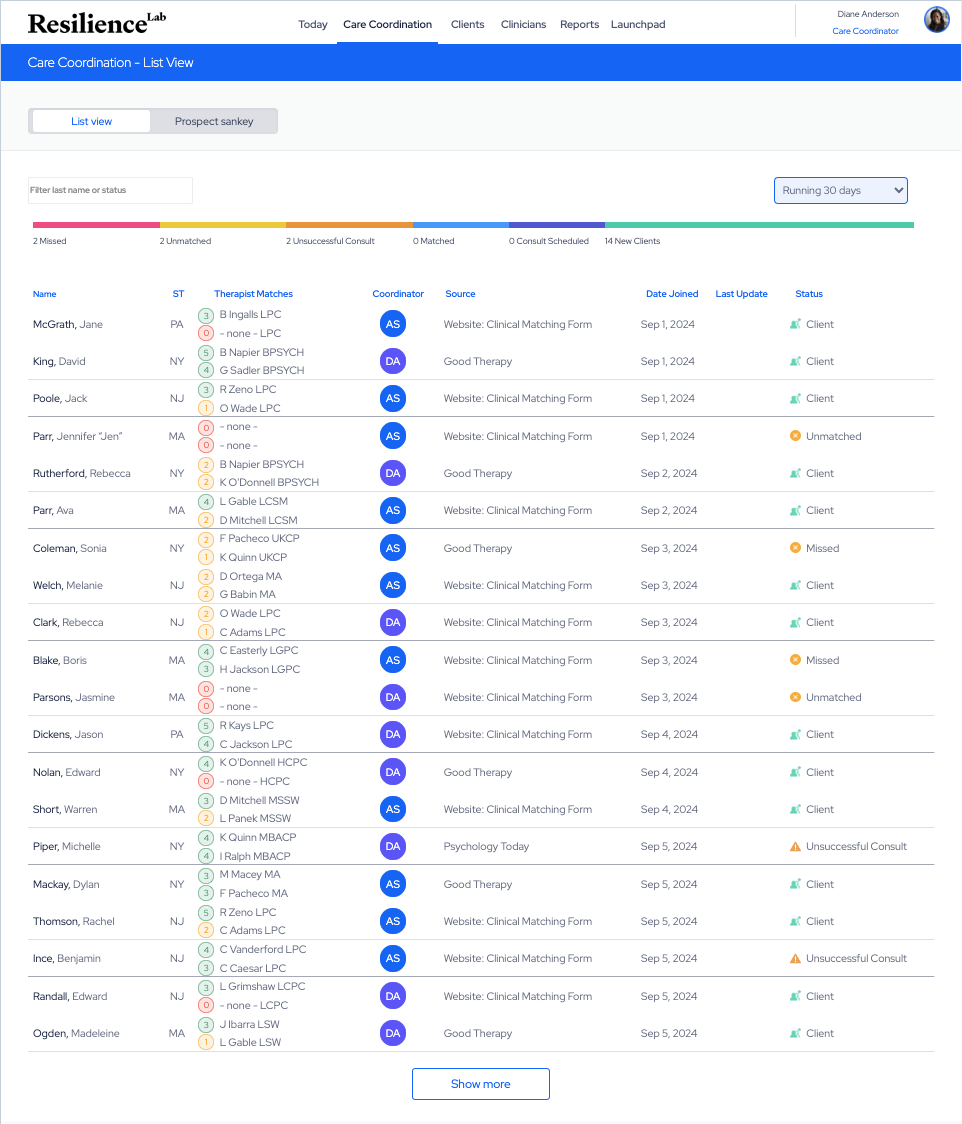
As we worked to scale our platform, the next major hurdle was determining an effective organizational structure that could efficiently connect the many qualified therapists with the clients who needed their expertise – a task that required careful consideration and strategic planning to ensure seamless matching and optimal outcomes for all parties involved. We knew that every moment counted in this crisis, and that our system had to be able to quickly and accurately connect individuals with the right therapist at the right time, while also ensuring that therapists were matched with clients who shared their specialties and availability.
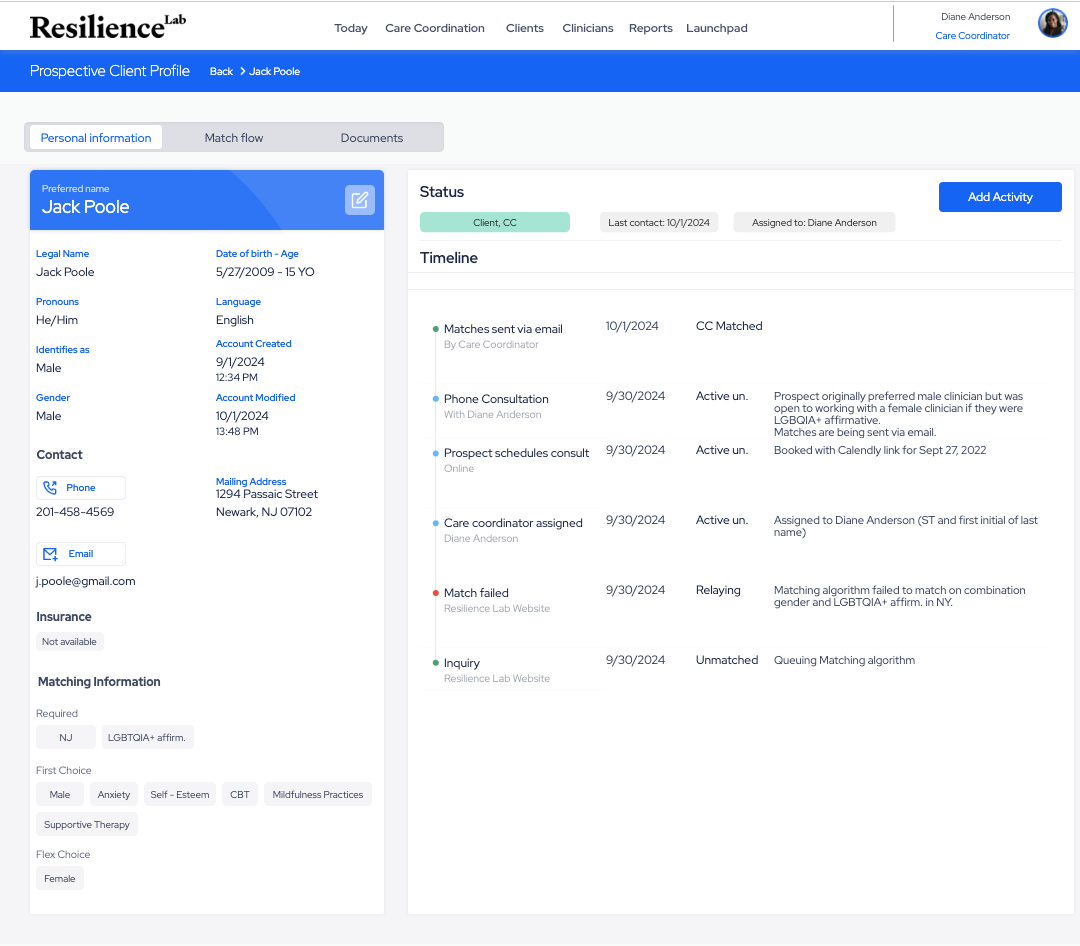
We identified the biggest challenge for our users as scheduling sessions with ideal therapists. We aimed to simplify this process by designing a seamless booking workflow, allowing therapists to schedule appointments efficiently and increasing successful matches. Additionally, we recognized the importance of insurance coverage, integrating a user-friendly verification process into our platform to ensure accurate billing and patient peace of mind.
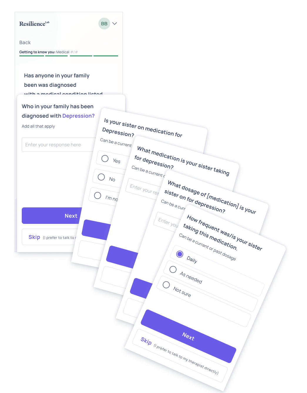
Acquiring the necessary pre-consultation information from users proved to be a challenging task, requiring extensive testing and iteration to get it just right. We needed to strike a balance between gathering enough details to provide effective matches and keeping the process fast-paced and user-friendly, all while ensuring that therapists received the relevant context to deliver high-quality care. Our initial tests required an hour to complete, but through perseverance and refinement, we were able to whittle down the time to under 8 minutes by the time we finished – a significant reduction that greatly improved the user experience. Through trial and error, we refined our approach to ensure a smooth and efficient experience for both users and therapists, ultimately resulting in a robust system that supports meaningful connections and improved mental health outcomes.
As our application aimed to connect mental health professionals with patients, we recognized the importance of designing an intuitive experience that catered to diverse user needs. Since our platform would be accessed by therapists and counselors likely on desktop devices, while clients may use a range of devices – including web and mobile – we needed to develop a robust design language that accounted for various viewport sizes and types. Our goal was to ensure a seamless and enjoyable experience regardless of the device or screen size, allowing users to easily navigate our platform and access the support they need. To achieve this, we focused on creating a flexible and responsive design that could adapt to different screen resolutions, devices, and orientations – ensuring that our application remained user-friendly and accessible across all platforms.
As we built our mental health platform, we established a robust design system using design tokens – reusable elements defining the visual language. This enabled us to create a consistent user experience, even as the app evolved. By integrating Human-Centered Design (HCD) principles, we focused on users’ needs and behaviors, informing design decisions with empirical data and testing.
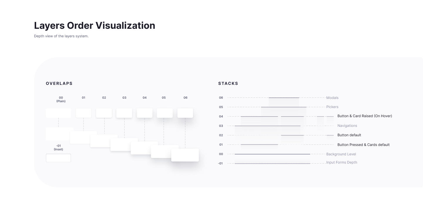
As we worked to build our mental health platform, budget constraints played a significant role in shaping our development process. Despite these limitations, we were determined to create an impactful application that would make a meaningful difference in people’s lives. Over time, our team has continued to evolve and improve the platform, refining its features and user experience based on feedback from therapists, counselors, and clients. Although I am no longer directly involved with the project, it is heartening to see that the application continues to be developed and improved today, a testament to the dedication of the original team and the ongoing commitment to delivering a high-quality tool for mental health professionals.
