Pearl Health started with the goal of bringing revenue stability to Medicare servicing physicians. It quickly grew to extend to helping Primary Care Physicians take control of their patients care.
My role
Built and managed a product design team of 4
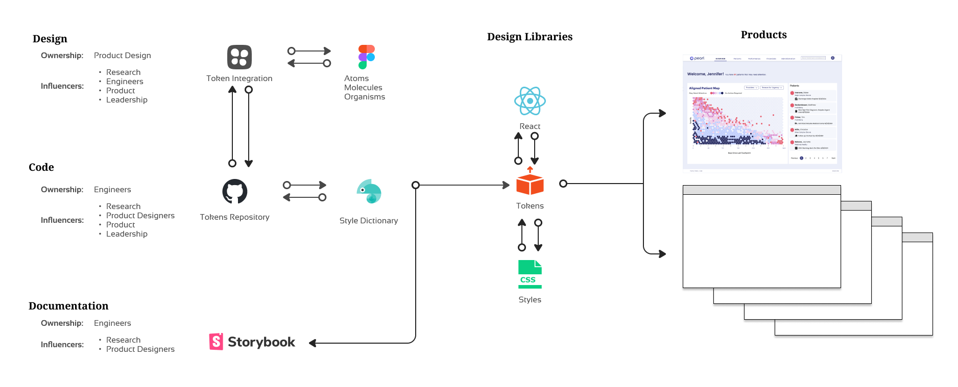
Developed and maintained a design language for a new patient management tool
User research, prototyping, UI design
Developed and maintained a design language for a new patient management tool
User research, prototyping, UI design
Results
Patient care platform’s revenue grew from zero to exceed Pearl Healths protected revenue.
This directly contributed to a series B and partnerships with some of the largest healthcare brands.
This directly contributed to a series B and partnerships with some of the largest healthcare brands.
It starts with research. The goal was to create a new version of an application for small to large medical practices. With time this version would move the core activities from reactive to proactive.
Crafting a Product with Purpose
As I envisioned our product, I aimed to create an intuitive experience that would resonate with everyone, from newcomers to seasoned experts. However, I recognized the pitfall of trying to cater to all, potentially resulting in a mediocre solution that fails to genuinely help anyone. To avoid this design equivalent of an identity crisis, I prioritized injecting a clear point of view into our product, while also acknowledging what it wasn’t meant to be. This deliberate focus allowed us to create a solution with purpose, rather than a vague compromise that might appease no one.
The research never stops
Establishing Direction through Data-Driven Insights
To guide our rapidly growing product, design and development team, we recognized the need for clear constraints that would help them focus on specific objectives. This necessitated a comprehensive approach to user research, providing valuable insights that informed our strategy and ensured everyone was working towards the same targets.
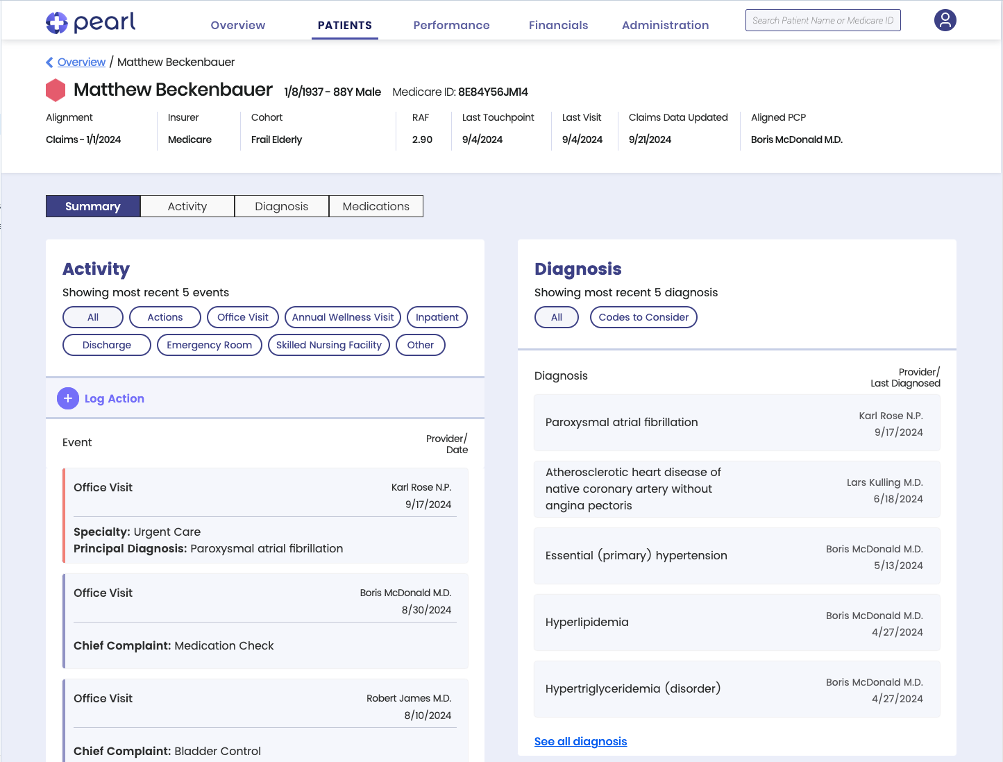
Pearl Health starts with a curated shortlist of 5 events that if done everyday would allow the caregivers the ability to “catch up” and stay caught up.
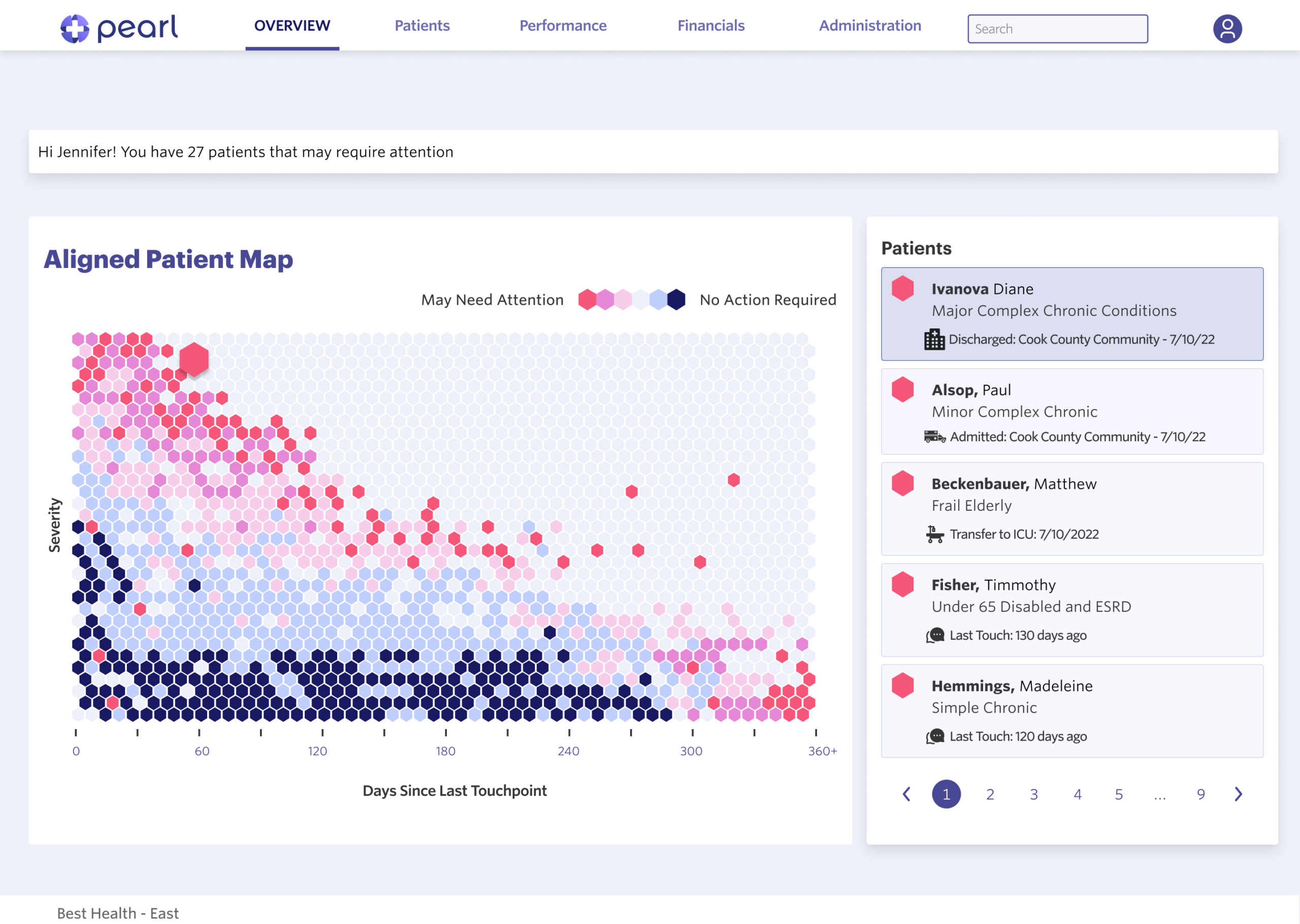
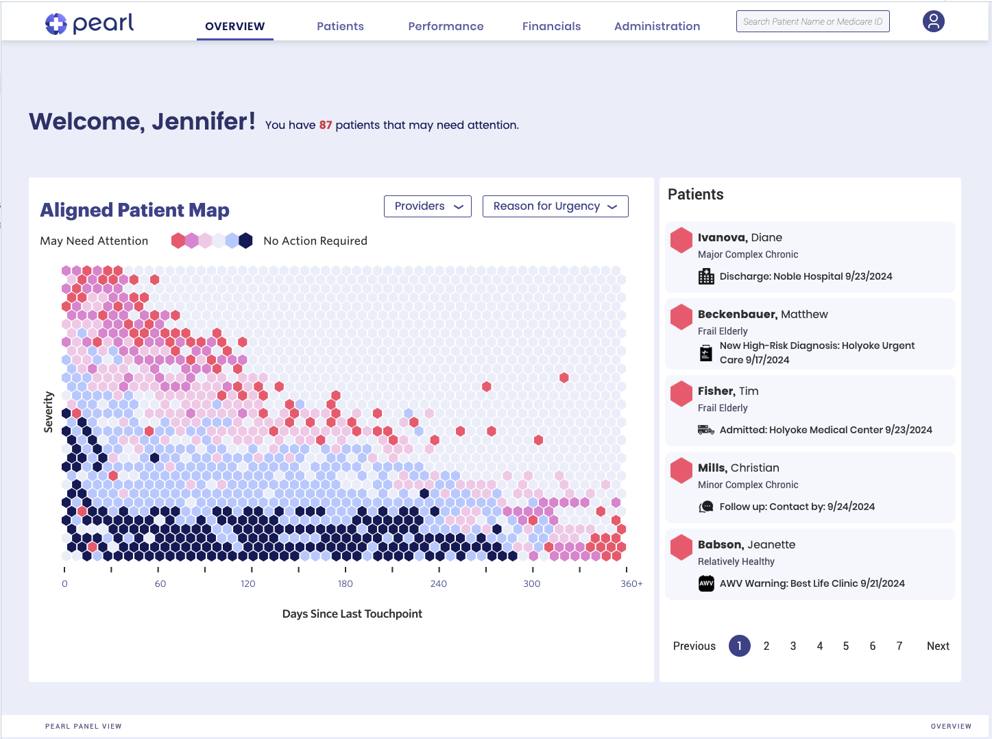
I was tasked with translating the background knowledge of our CPO and director of product into a web experience. Task one was enabling the physician to have a birds eye view of the patient pool. The hex chart allowed us to do that. While applauded by the customers in reviews, it soon became apparent that we needed more information sooner. The hex chart has evolved into more containing detailed drill downs.
Patient data can be extremely dense, but with an intuitive UI, providers can quickly find what they need to know. My design enables rapid access to critical details like vital signs, medications, and lab results.
To further enhance the user experience, I incorporated visual aids to help spot trends and patterns in the data. This allows providers to quickly identify important information and make informed decisions. Additionally, I implemented robust filtering and sorting capabilities that enable providers to narrow down search results based on specific criteria such as patient diagnosis history, condition, or treatment plan.
Moreover, I developed a powerful keyword-based search function that enables providers to find specific information quickly and efficiently. This feature ensures that critical data is easily accessible, even in the most dense datasets. Finally, by highlighting key patient data points, I made it easy for providers to prioritize important information and focus on what matters most.
Moreover, I developed a powerful keyword-based search function that enables providers to find specific information quickly and efficiently. This feature ensures that critical data is easily accessible, even in the most dense datasets. Finally, by highlighting key patient data points, I made it easy for providers to prioritize important information and focus on what matters most.
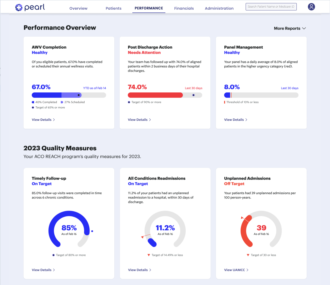
Revenue opportunities include value-based payments, care coordination fees, and reduced hospital readmissions. Visualization is key to driving success.
Visualization is crucial for providers because it helps them:
Make sense of complex data: Healthcare data can be overwhelming and difficult to analyze without the right tools. Visualization makes it easier to understand trends, patterns, and correlations.
Focus on high-impact areas: By identifying priority areas, providers can concentrate their efforts on initiatives that will have the greatest impact on patient outcomes and financial performance.
Evaluate progress and adjust course: Visualization enables ACOs to track their progress over time, identify what’s working well, and make adjustments as needed.
By visualizing their data, providers can drive success by making informed decisions, optimizing their operations, and improving the overall health of their patients.
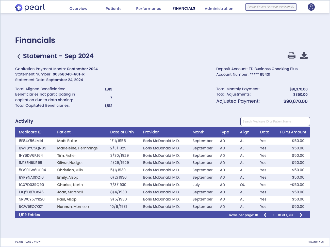
Coordinating financial data back to patients is the key to unlocking the full potential of value-based care in Accountable Care Organizations (ACOs).
By linking patient outcomes to financial metrics, providers can make informed decisions that drive better health and reduced costs. This powerful approach enables providers to optimize their care delivery, engage patients more effectively, and reduce waste and errors.
With a clear understanding of the financial implications of different treatment options, providers can deliver high-quality, patient-centered care that maximizes value for both the patient and the healthcare system. By harnessing the power of data-driven insights, ACOs can achieve their goals of improving health outcomes, reducing costs, and enhancing the overall value of healthcare services delivered.
With a clear understanding of the financial implications of different treatment options, providers can deliver high-quality, patient-centered care that maximizes value for both the patient and the healthcare system. By harnessing the power of data-driven insights, ACOs can achieve their goals of improving health outcomes, reducing costs, and enhancing the overall value of healthcare services delivered.
