Ayva provides the power of onsite preoperative and postoperative care in a simple and elegant interface. I created Ayva’s product design and user experience.

My role
User research
Prototyping
UI design
Built and maintained a design system
Results
Eased application acceptance – Net Promotor Score of 91 with first release
Task success of 88% with first time access. 
Decreased design to dev handoff time
Reduced No Show for preop by 47%
HOOS and KOOS up 22%
For an ordinary person, anything related to surgery seems scary and painful.
The truth is that most people simply do not know how to be their own advocate, most of us would rather choose to not think about it. Therefor simplicity and humanity were the key tenets to inform everything from within the application itself, from the user experience of the app.
Ayva allows to you to monitor and control activity as you progress towards surgery. The app is focussed around two key use cases – positive reinforcement and alerting when things are off track or aren’t going as planned.
To define the architecture of the app, we asked our users, surgeons and case managers to define what are some of the most important questions that come to mind about their surgery. Those were shortlisted to top 3:
1. Will I be okay? How much will it hurt?
2. What can I do to have a better outcome?
3. How long until I feel better, when can I come home?
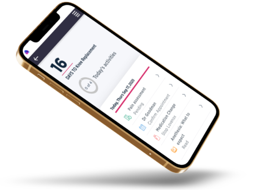
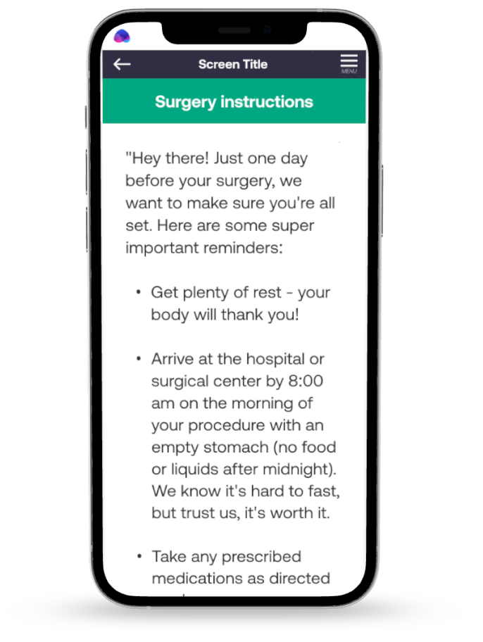
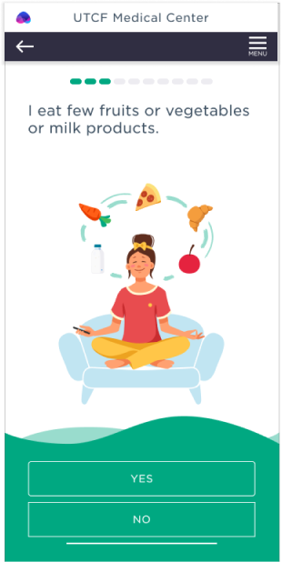
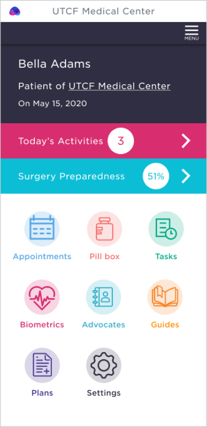
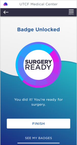
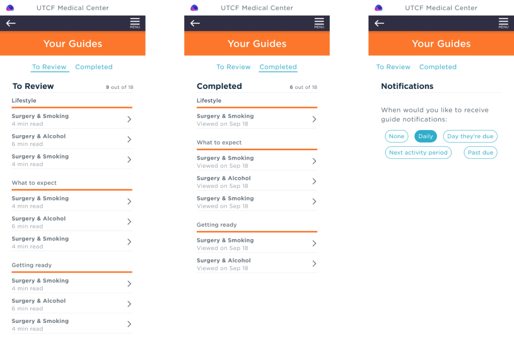
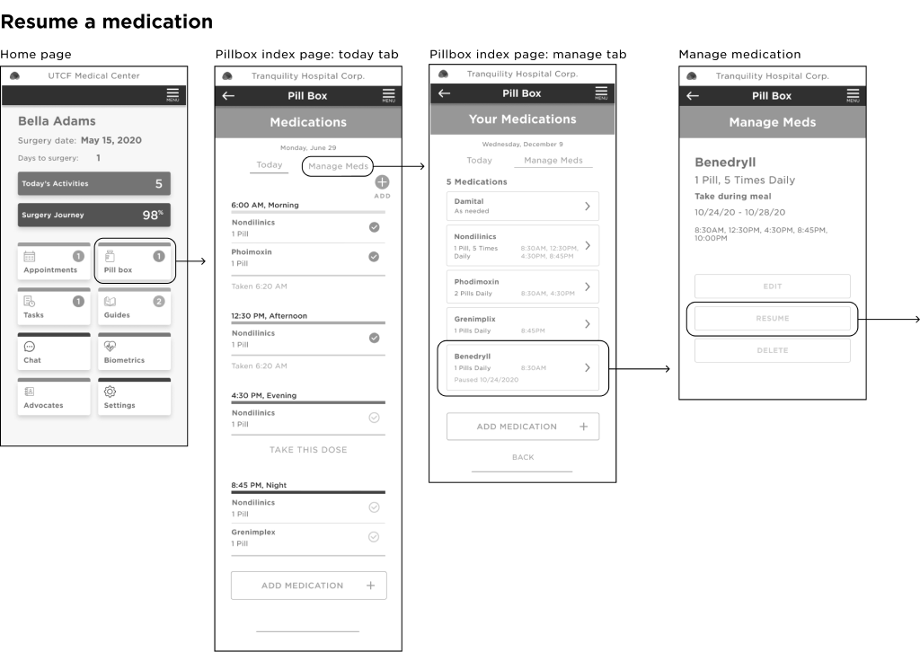
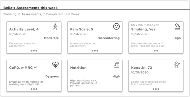
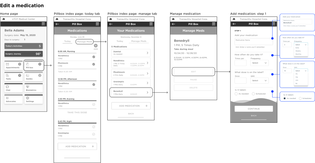
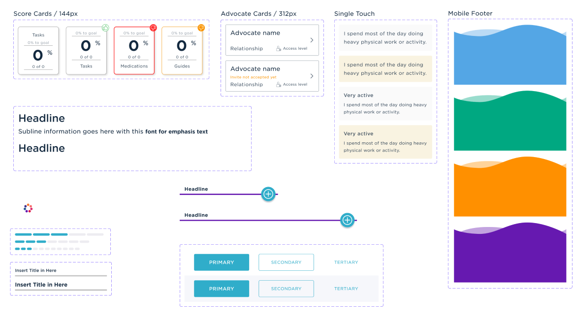
From a series of prototypes, we landed on a tab-based app architecture, each dedicated to a specific aspect of the process: learning, medications, appointments, and assessments in a clean fun to use (gamification) dashboard with an overview of actives and tasks. A card-based UI allowed to easily scale the dashboard as additional features were developed. 
Part of Ayva’s promise is to encourage and account for every concern a patient might have. Naturally, we needed a surgery library that guided the user through the process in bite size pieces. We needed to anticipate each question from when can I go home to why is my incision green to is it safe to have sex again. 
We designed a simple yet powerful UI for scheduling appointments, medication and other tasks. This is easily shared so that advocates (partner, adult child, care provider) can be informed of progress and next steps. We know things change daily in a patients life, the application should adapt to those changes quickly and easily.
At the top of app’s most requested features were medication reminders and controls. Our users wanted to be able to control medication reminder quantity sometimes as a question (e.g. “Did you take your meds today?”) or as a statement (e.g. “Its time for your 3:00PM medications”). The framework had to be simple, yet flexible enough to support individualized restrictions (e.g. “Reminder: stop taking Warfin and start taking…” ), and assign those to specific schedules (e.g. before med is due, summary of meds taking today or a summary at the end of the day/week). 
The Care Manager can also see this same view to assist with anything the patient or family might need to know. the Care manger has their own UI that shows this information and other information thats tracked on the patient. This puts them in a great position when communicating with the patient or advocate to ask better questions and nudge or congratulate the patient. During COVID these types of trackers were invaluable as the demand for services sky rocketed, especially as patient services resumed.
We knew we could provide additional value by displaying aggregate usage data for each patient.
We extracted the most meaningful metrics (number of missed medications and appointments, most active times of day, and time spent in each learning category) from the patients’s online activity, and visualized them as cards with a summary of each data point. As a result, we could provide our care managers with an additional information on which patients were performing and which needed a helping hand. Giving insights into how prepared a patient actually was. Ayva was able to accurately produce expected outcomes to within a few percentage points. 
Apart from the ease of use, the clarity of patient medication management was crucial. Analyzing the funnel we were able to identify their biggest pain points and streamline the flow for the least amount of steps and highest completion ratio.
Design System
The complex nature of the app necessitated more than 120 screens covering user on-boarding, medication setup, support and features like advocate levels of access.