Ayva
Ayva fundamentally rethinks how patients plan and manage preop using data science, accounting domain expertise, and machine learning.
While most services focus on WHAT, Ayva tells you WHY, what happens if you don't, and what you should do today.
Patients tend to hate most medical applications, they are often dull, unintuitive, and they bring to mind the things the patient doesn't want to think about - surgery.
I worked with the product leadership and our CMO to translate their vision into a product that meets patients' needs.
Overview
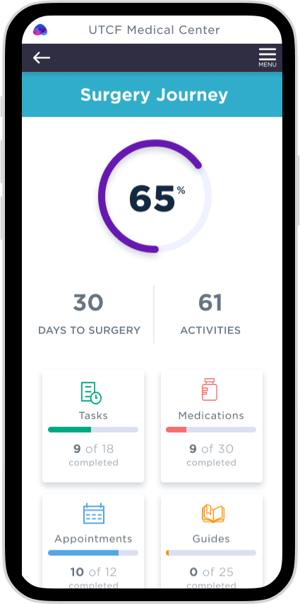
Ayva is a web-based application comprised of two interfaces, caregiver (clinician) and patient (mobile web).
The patient-facing (shown) intentions:
- Improve the surgical journey for everyone involved.
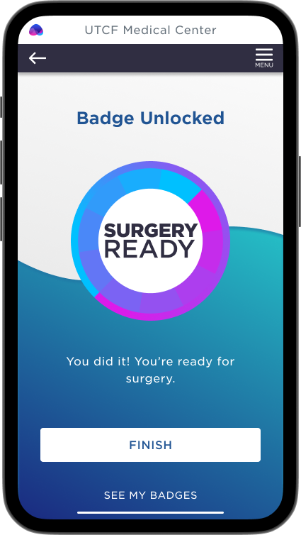
- Remind the patient what they need to do for the 30 days before surgery and the 30-60 days after surgery.
- Utilize technology to assist the patient at each interaction.
This relentless focus on only showing what matters saves patients time, effectively giving them more confidence and better outcomes.
Why does Ayva work?
Many health apps fail because they don't fully understand their target market. The causes behind this can run deep. Usually, produced without individuals who have the knowledge or information to ensure the tech works as it should. The apps frequently use jargon, heavy-handed tactics, or frequent texts and emails.
Regardless of the elegance, ease of use, enjoyable experience, or another appeal of a health app, it must address a specific problem to be considered beneficial and adhered to. Monitoring a physiologic parameter, a person's mood, or collecting data because an app can do so is a recipe for failure. It has to work how the patient expects it to work and be enjoyable. Ayva is a silk glove on the shoulder, never judging but always lifting the user up.
Initial deployments showed immediate improvements; the normal utilization is 2-7%. Ayva started at 12% and, in 90 days, leveled out at 65%. Comments about how much the patients love Ayva were frequent. A few patients called the office to speak to "Ayva."
I was the sole designer on this project, partnering with the business and the technical leaderships. I conducted user research, prototyped designs, and tested and retested them personally. I quickly distilled the insights gained into something built and put it into the hands of beta testers. I also created a component library and design principles to allow the team to continue building out and prototype features.
Project roles and responsibilities
Product Design
Stakeholders
Applications
Myself leading two product designers and a UX writer. I was engineering liason.
Provide technical data on medical practices, guidelines for roadmap.
Axure (prototyping), Sketch and Zeplin transitioned into Figma.
Research, Interviews, Conceptions, Prototypes, and Final Design.
Chief Product Owner, Product Owner, Chief Medical Officer and Data Science.
What is the Problem?
tive causes or because of an improved patient condition (1% each).
Patients may cancel the day of surgery out of fear. It's very common for the patient to not do the surgical wash (Hibiclens), not change their medication, not arrange for transpartation, or just not show up. In a recent study 22% of the patients were contacted 24 hours before surgery and still did not to come to the hospital.
It's not uncommon for the patient to "give up" and allow their condition to worsen.
Patients are on a journey from the moment they know they need surgery until months or even years after the surgery. The confidence they have is directly porportial to the prepardness they have before surgery. I truly prepared patient will have better outcomes, a shorter recovery time and are more likley to see the procedure as a success.

22%
No Show

17%
Surgical Issues

14%
Acute conditions
Why is this happening?
Surgery is scary, even when it's elective; even people who have had multiple surgeries report a sense of dread and helplessness. No wonder 16% of patients would rather face life-ending decisions than have surgery.
- Patients are not confident that they understand the surgical process.
- Patients' families and advocates may not believe the patient needs the surgery.
- Patients fear the pain during recovery and often question if they will ever be well again.
Solution
Create a system that allows patients to manage the schedule and pre/post op activites to move from reactive to proactive.
- Do away with binders of discharge paperwork that is unlikely to be read.
- Automate the reminders that go out to only the patients who need reminders.
- Encourage patients through education while allowing them to learn when convenient for them.
- Allow the patient to see when they are drifting off track and fix themselves without guilt.
- Family members can visually see how to course correct when patients aren't following the surgery plan.
Design process
I chose Double Diamond. It's been around for 20 years. I knew this would be several years of changes as we learned and grew.
We needed to have a design process that evolved around research and iterations.
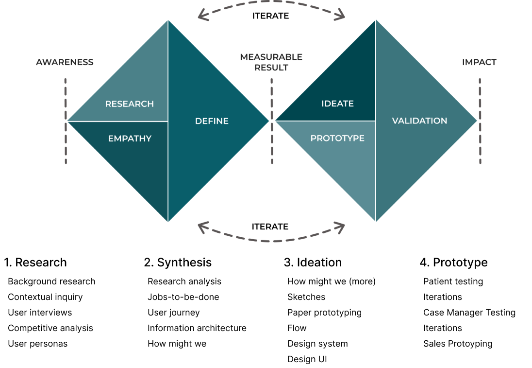
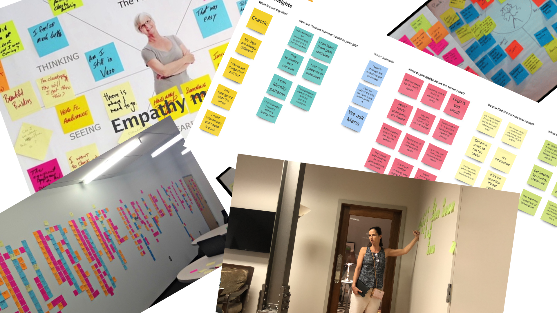
Research
Patients are often in a state of near shocck when they leave a surgeons office or medical consult where the outcome is surgery. The cognative load is quite high and it's not uncommon theyt may ask the same question several times. They are usually supplied with a stack of papers or directed to a web portal to help them prepare for the surgery. The portals tend to be designed around the print format. Explinations tend to be very verbose with healthcare terminology and diffcult to search or glean the information that a patient or family member needs.
Pain Points
Patients are not prepared for transportation to and from surgery.
Patients have not made medication changes or followed Hibiclens protocol.
Patient social detriments were not uncovered prior to surgery consults.
Patient is not prepared for the recovery cycle. A patient may then allow the first two days after surgery to dictate the outcome.
Synthesis
Qualitative - With a medical application, more diligence is required when doing research. There is more data to review, and it has to be validated with the current advancements in the medical world.
Quantitive - We talked to industry experts, advisors, board members and our staff SMEs. We also painstakingly detailed calls that case managers took and reviewed how they worked.
Ideation
Ideation took the form of working on "How might we..." statements, sketches, low and high fidelity wireframes. We also started imagining the type of UI and controls. Would the practice need charts, or tables? Could data be encapsulated in cards etc? Early iterations focused on too much data. Several iterations later, we had just enough information visible to be efficient and detailed information easily accessible.
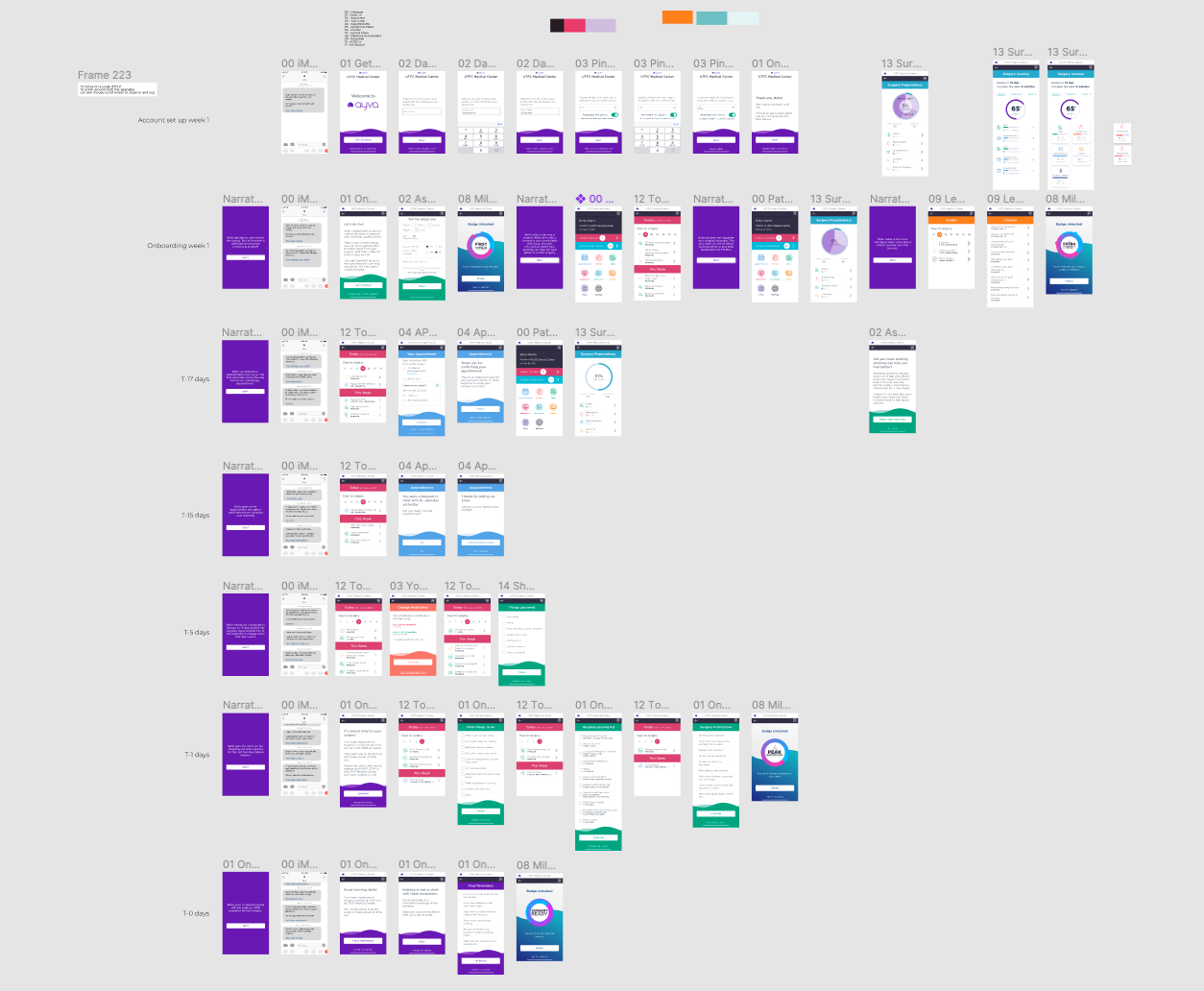
Wireframes
As you can see from the wireframes below we invested time into understanding the actionable activities a user might need to complete.


Prototyping
Paper prototyping works well, but during Covid, it proved to be very difficult to test with. Figma prototyping was fast, but the data was static and didn't reflect the interactions we needed to confirm. Axure excelled at this giving us the result we required.
Please feel free to review the Figma Protoype. This was used to train sales people and give engineering insight into the work to be done.
Conclusion
Due to brevity, I only shared a few of the many daily design decisions.
I worked with the team to manage issues:
- 8pt grid
- Design library management
- Design tokens
- Voice
- Content management
- HIPAA (and other regulations)
Click below to see the clinician-facing case study.
Case Studies
Pearl - Case StudyProduct Design
Ayva Ortho - Case StudyProduct Design
Ayva (Patient Facing) - Case StudyProduct Design
© 2012-2023 James Young -- Principal Product Designer